
The Best Colors to Make Your Student Apartment Feel Bigger
Living in a student apartment often means dealing with limited square footage. But don’t worry – with the right color tricks for small spaces, you can create the illusion of a more spacious, open environment without knocking down any walls. Strategic color choices can dramatically transform how your space feels, making even the tiniest studio apartment seem airy and inviting. In this guide, we’ll explore proven color techniques that maximize space perception while fitting student budgets and rental restrictions.
How Color Psychology Affects Space Perception
Before diving into specific color tricks, it’s important to understand how our brains perceive color in relation to space. Light colors tend to recede visually, making walls appear farther away, while dark colors advance, making surfaces feel closer. This optical illusion is the foundation of using color to manipulate spatial perception.
Cool tones like blues and greens create depth and distance, while warm tones like reds and oranges feel more intimate and closer. For small student apartments, this knowledge becomes a powerful tool in your decorating arsenal, allowing you to strategically expand your space visually without structural changes.
Color Trick #1: Soft Whites & Neutrals to Maximize Light

Why It Works
Soft whites and light neutrals are the classic go-to colors for small spaces because they reflect natural light instead of absorbing it. This reflection creates brightness that opens up the room and makes walls appear to recede. In student apartments where natural light might be limited, this trick becomes especially valuable.
The key is choosing whites with the right undertones. Pure whites can sometimes feel stark or clinical, while whites with subtle undertones (cream, off-white, or whites with hints of gray) create a softer, more welcoming atmosphere while still maximizing the space-expanding effect.
Best Shades to Try

Benjamin Moore White Dove
A soft, warm white that creates an airy feel without the harshness of pure white.
What Else Would You Like to Know?
Choose below:

Behr Polar Bear
An affordable neutral white with subtle warmth that works in any lighting condition.

Sherwin-Williams Alabaster
A creamy white with yellow undertones that creates a soft, expansive feel.
Color Trick #2: Cool Blues & Greens for Depth

Why It Works
Cool colors like soft blues and gentle greens naturally recede visually, creating the perception of more space. These colors mimic the expansiveness of the sky and outdoors, bringing that sense of openness into your student apartment. They’re particularly effective in rooms with limited natural light or north-facing windows.
Cool tones also have a calming psychological effect, making them perfect for study areas and bedrooms where focus and relaxation are important. The right shade can make your small space feel both larger and more conducive to academic success.
Best Shades to Try

Sherwin-Williams Rainwashed
A soft blue-green that creates a fresh, airy atmosphere in small rooms.

Behr Light French Gray
A cool gray with blue undertones that adds sophistication while expanding visual space.

Benjamin Moore Breath of Fresh Air
A light, airy blue that makes walls appear to recede, creating a sense of openness.

Before and after: See how cool blue tones visually expand this study area
Color Trick #3: Strategic Accent Walls to Guide the Eye

Why It Works
An accent wall is a powerful color trick for small spaces that creates depth and visual interest without overwhelming the room. By painting just one wall in a deeper or more vibrant color, you create a focal point that draws the eye through the space, creating the perception of greater depth.
For student apartments, accent walls offer the perfect balance – they allow you to incorporate color and personality without committing to painting the entire space. This is especially valuable in rentals where you might need to return walls to their original color when moving out.
Strategic Placement Tips
DO accent these walls:
- The wall you see first when entering the room
- Walls with architectural features like windows or built-ins
- Walls behind your bed or desk to create a focal point
- The farthest wall in a narrow room to create depth
DON’T accent these walls:
- Walls with doors or irregular shapes
- Multiple walls in the same small room
- Walls that already have busy patterns or textures
- Walls that divide small spaces (makes them feel smaller)
Best Accent Colors for Small Spaces

Behr Blueprint
A medium-toned blue that adds depth without overwhelming small spaces.

Sherwin-Williams Pewter Green
A sophisticated muted green that creates dimension and warmth.

Benjamin Moore Hale Navy
A classic navy that creates dramatic depth without closing in the space.

How accent walls create the illusion of depth in small spaces
Color Trick #4: Glossy Finishes to Reflect Light

Why It Works
Paint finish is just as important as color when it comes to making small spaces feel larger. Glossy and semi-gloss finishes reflect light, creating brightness that expands visual space. This color trick for small spaces is particularly effective in areas with limited natural light, like interior hallways or windowless bathrooms.
For student apartments, strategic use of glossy finishes can dramatically brighten dark corners and cramped spaces. The reflective quality mimics the effect of mirrors, bouncing light throughout the room and creating the illusion of more square footage.
Best Applications for Glossy Finishes
Ideal Locations:
- Kitchen cabinets and backsplashes
- Bathroom walls and ceilings
- Hallways with limited natural light
- Ceilings (to create the illusion of height)
Recommended Products:
- Behr Ultra Semi-Gloss Enamel
- Sherwin-Williams Emerald Gloss
- Benjamin Moore Advance High-Gloss
- Glidden Premium Semi-Gloss

Matte vs. Glossy: See how finish affects light reflection and space perception
Color Trick #5: Matching Trim & Walls to Reduce Visual Breaks

Why It Works
Traditional design often calls for contrasting trim and wall colors, but in small spaces, this creates visual breaks that can make a room feel chopped up and smaller. By painting trim, moldings, and doors the same color as your walls, you create a seamless flow that visually expands the space.
This color trick for small spaces works by eliminating the “stopping points” for your eye, allowing your gaze to travel continuously around the room. The result is a more expansive feel, perfect for tight student apartments where every visual inch counts.
Implementation Tips
For Maximum Effect:
- Use the same color for walls, trim, and doors
- Consider painting built-in shelving the same color
- Maintain a slight sheen difference for subtle definition
- Choose light to medium tones for best results
Perfect Color Pairings:
- Benjamin Moore Pale Oak (walls) with semi-gloss Pale Oak (trim)
- Behr Silver Drop (walls) with semi-gloss Silver Drop (trim)
- Sherwin-Williams Agreeable Gray (walls and trim)
- Glidden Dove White (walls and trim)

Before: Traditional contrasting trim creates visual breaks. After: Seamless color expands the space.
Bonus Trick: Vertical Stripes to Heighten Ceilings

How vertical stripes trick the eye into perceiving greater ceiling height
Just as vertical stripes on clothing create a slimming effect, vertical stripes on walls draw the eye upward, creating the illusion of higher ceilings. This is particularly effective in student apartments with standard 8-foot ceilings that can feel confining.
You don’t need to commit to bold wallpaper – subtle tone-on-tone stripes using the same color in different finishes (matte and semi-gloss) create a sophisticated effect that expands the perceived height of your space without overwhelming it.
DIY Vertical Stripes on a Student Budget
Create subtle vertical stripes using painter’s tape and two sheens of the same paint color. Paint your entire wall in flat or matte finish, then tape off evenly spaced vertical stripes (4-6 inches wide). Paint over the taped areas with the same color in semi-gloss finish. When you remove the tape, you’ll have subtle, sophisticated stripes that catch the light and draw the eye upward.
Best Paint Brands for Student Budgets

Behr Premium Plus
Best Value
Affordable paint-and-primer combo that covers well in 1-2 coats. Available at Home Depot with frequent sales under $30/gallon.

Glidden Premium
Most Affordable
Budget-friendly option under $25/gallon with decent coverage. Perfect for temporary student housing where you’ll repaint when moving out.

Sherwin-Williams Captivate
Most Durable
Mid-priced option with excellent washability – perfect for high-traffic student apartments. Watch for 30-40% off sales.
Renter-Friendly Paint Tips
- Check your lease before painting – some allow painting with landlord approval
- Keep paint codes for touch-ups before move-out
- Choose washable finishes (eggshell or satin) for easy cleaning
- Save leftover paint for returning walls to original color if required
- Consider peel-and-stick wallpaper as a no-paint alternative for accent walls
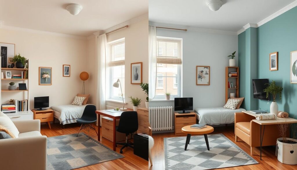
Color Temperature: Warm vs. Cool Tones in Small Spaces

Left: Warm tones create coziness. Right: Cool tones create expansiveness.
Warm Tones
Warm colors like beiges, soft yellows, and terracottas create a cozy, intimate atmosphere. While they don’t visually expand space as effectively as cool tones, they’re perfect for north-facing rooms that need warmth or study spaces where you want a comforting environment.
Best warm tones for small spaces:
- Behr Almond Wisp (soft beige)
- Benjamin Moore Manchester Tan (neutral warm beige)
- Sherwin-Williams Creamy (warm off-white)
Cool Tones
Cool colors like soft blues, greens, and grays visually recede, making walls appear farther away. They’re ideal for maximizing perceived space in tight quarters and work especially well in south-facing rooms that get plenty of warm natural light.
Best cool tones for small spaces:
- Behr Light French Gray (cool gray)
- Benjamin Moore Breath of Fresh Air (light blue)
- Sherwin-Williams Sea Salt (blue-green gray)
3 Quick Tips for Renters

Removable Wallpaper
Can’t paint? Peel-and-stick wallpaper creates instant impact without damaging walls. Look for large-scale patterns in light colors to expand visual space, or use it to create an accent wall that draws the eye.

Sheer Curtains
Maximize natural light with sheer window treatments that allow sunshine to penetrate deep into your space. Hanging curtains close to the ceiling and extending beyond the window frame creates the illusion of larger windows.

Light-Colored Furniture
Choose multi-functional furniture in light hues to maintain the spacious feel created by your wall colors. Bulky dark furniture can undo the space-expanding effects of your color scheme.
Transform Your Student Space with Color
With these color tricks for small spaces, you can transform even the most compact student apartment into a place that feels open, airy, and perfectly suited to your lifestyle. Remember that color is one of the most powerful and affordable tools at your disposal for creating the illusion of space.
Start with one room or even just an accent wall to experiment with these techniques. You’ll be amazed at how strategic color choices can completely transform your perception of your space without changing a single structural element.
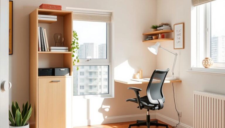
How to Create a Study Nook in a Small Apartment
» See exclusive tips for your home